Brand identity case study
Shivaun
From briefing to brand launch.
A complete brand-building exercise, from audience understanding and positioning to visual identity, product presentation and digital experience. The goal was a children’s brand that feels trustworthy, playful and thoughtfully designed for modern families.
Industry
Children’s apparel
Audience
Modern parents
Prepared
Bhavita Jain · Nov 2025
Brand strategy · Visual identity · Packaging concepts · Shopify store design
Project challenge
Natural, plastic-free clothing that still feels desirable.
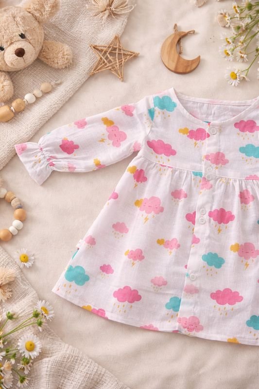
Modern parents are increasingly conscious of what touches their children’s skin, yet much of the children’s apparel market still relies on synthetic blends and mass-produced alternatives. The challenge was to build a brand that communicates trust, comfort and conscious living while making natural, plastic-free clothing feel approachable, playful and desirable.

Target audience
Parents who read the label.
- Parents aged 28 to 40
- Educated professionals
- Quality-conscious
- Value comfort and safety
- Interested in sustainability
Brand strategy
A children’s clothing brand that champions natural, plastic-free fabrics and the explorer spirit.
Brand pillars: Natural & plastic-free · Curiosity & exploration · Comfort without compromise · Conscious living · Thoughtful design
Creative direction
exploratory · nurturing · playful · conscious · natural · warm · timeless · gentle · adventurous
Identity & symbol exploration
Not just a brand package, but a story people could recognise themselves in.
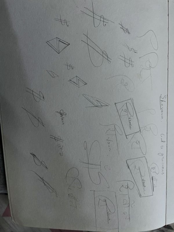
Inspired by the roots of the name Shivaun and its link to “God is gracious”, the first logo sketches explored symbols associated with Shiva. Traditional motifs didn’t match the brand’s emotional direction. The butterfly emerged as a more natural fit, carrying themes of exploration, growth, freedom and playful curiosity.
Typography, colour & brand elements
Type that feels clean, approachable and easy to read, with a sense of movement: Inters for headlines, Poppins for body text and Amsterdam One for the script wordmark.
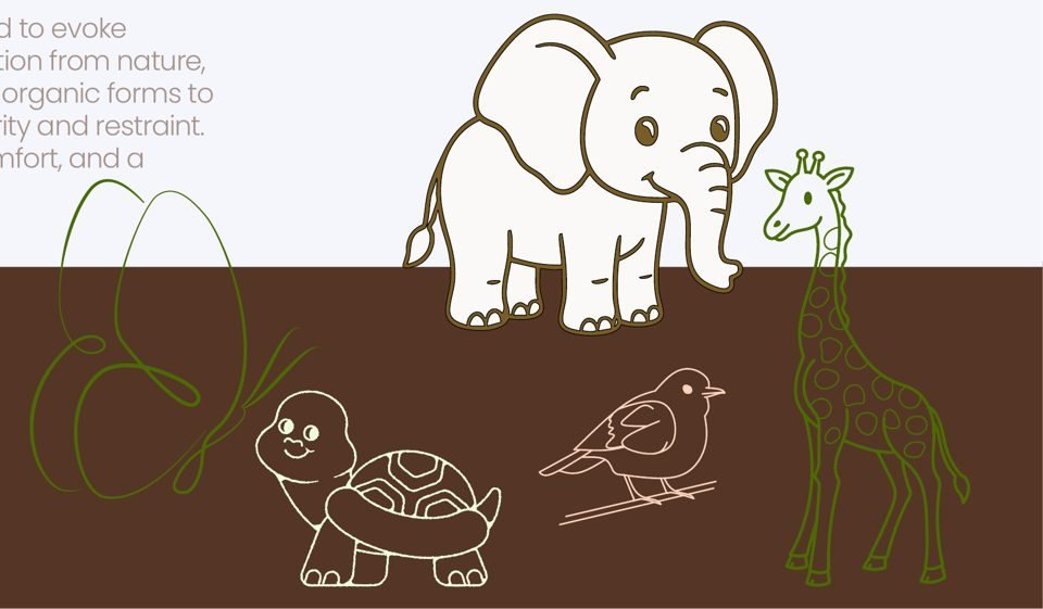
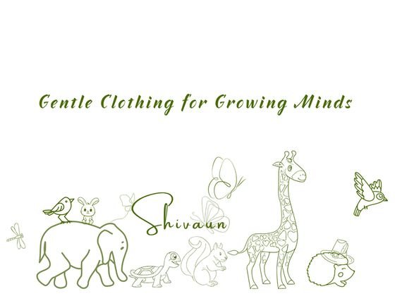
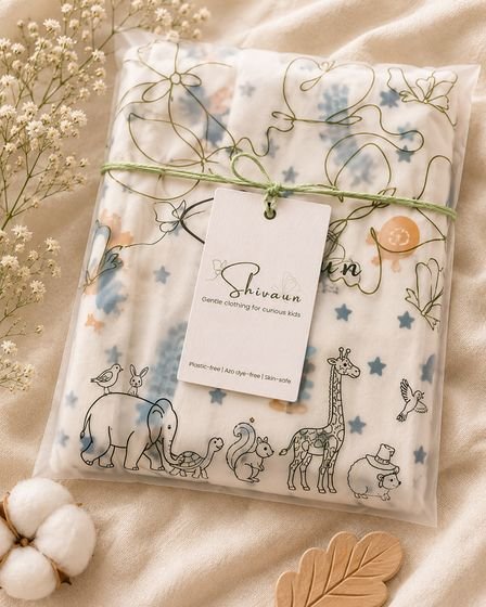
The palette and elements were made to feel warm, soft and exploratory. Drawing on nature, the identity uses subtle animal motifs and organic forms to build a playful visual world while keeping clarity and restraint.
Brand design & physical experience
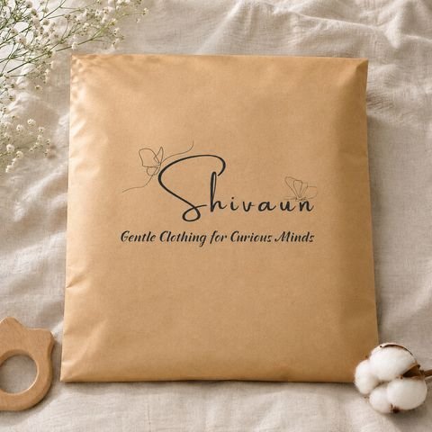
Softness, movement and simplicity, in the hand.
Digital brand experience
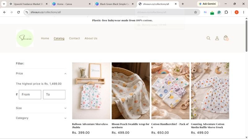
A Shopify store and social feed in the same voice.
The store leads with “Plastic-free babywear made from 100% cotton”. Social posts carry the same gentle lines: “Invisible clothing. The softest clothes are the ones that disappear on skin.”